Hey! What Are YOU Looking At?
Getting your message across on different screens
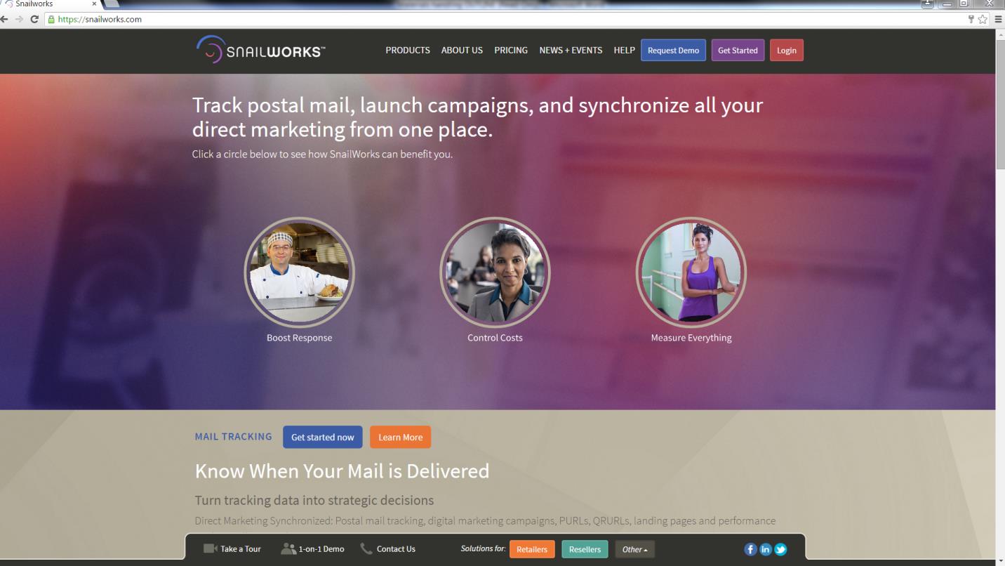
One advantage of paper over computer screens: At least you know what size a piece of paper is. The reply form you include in your direct mail package will be formatted exactly as you expect, and every piece will format exactly the same, because you printed it that way. Screens – not so much. When you take that same form and turn it into a landing page your prospect may view it on their desktop computer or, more and more, they may view it on a mobile device. This could be a smart phone or a tablet – which may have a seven inch screen or a twelve inch screen, or something in between. Something designed to look great on an iPhone may look stupid on a 24” monitor. Similarly, something designed to look great on the 24” monitor will be unreadable on that smart phone. Thus, responsive design. Responsive design is sort of a catch phrase to cover methods of designing web pages to work on a variety of devices. There are a few approaches, some more elegant and modern than others. The simplest design just shrinks the page as needed to show on the device which may be OK, but pretty tough to read in a lot of cases. There are other methods that essentially pick a web page format based on the device and serve that page up. If it’s a mobile device, it just displays a simplified mobile version of the page which will be readable and easy to respond to, but may sacrifice design and branding elements. There are companies that sell mobile page based web sites with a few specific templates – these are OK if they are ONLY going to be viewed on smart phones, but less OK if they may be viewed on a computer or a tablet. About the only time you can count on that is if the prospect is reaching the page from a QR code only. State of the art responsive design works with the overall design of the web page, and scales elements as the screen gets smaller – reducing the number of columns and adjusting font sizes. Our favorite example is the SnailWorks web page.
Here’s how it looks on a desktop screen:
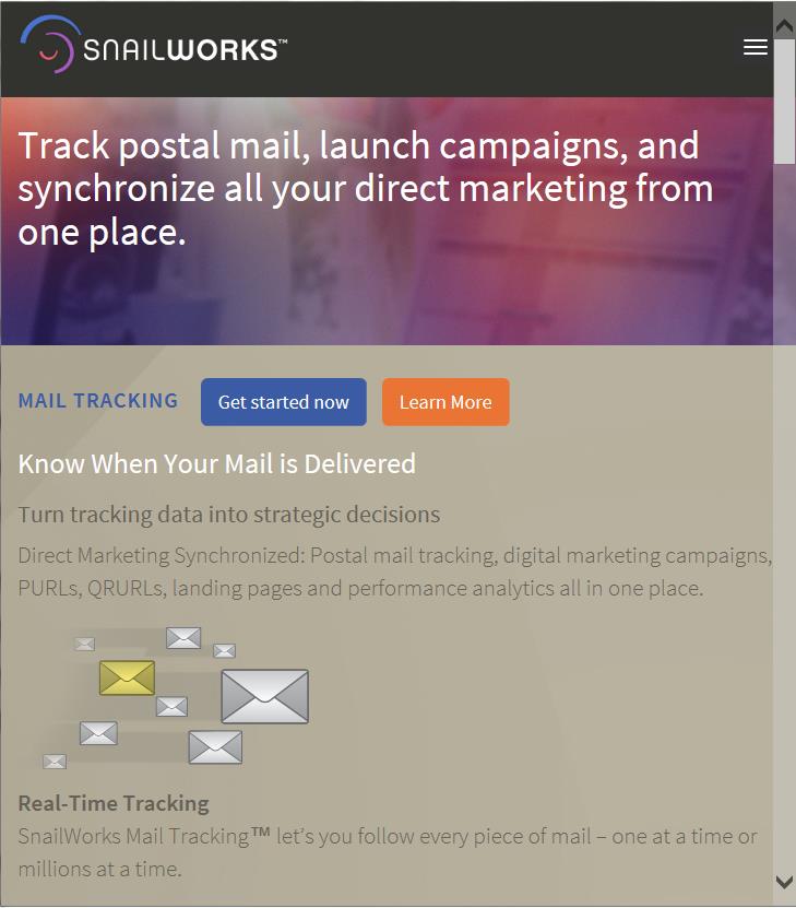
Or on a tablet:
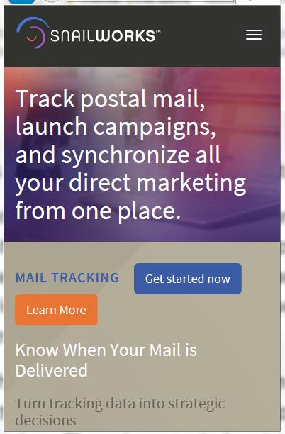
Or a smart phone:
You can simulate the effect by opening a responsive web page – like www.snailworks.com or our blog www.snailtalk.info - and by changing the window size you can see how the page reformats itself as the available window shrinks and expands. For a marketing landing page this is a huge deal, because you don’t know what device prospects are viewing your page on. You don’t want to design for one or the other – you want to design for them all – responsive design. Of course like everything on the Internet there are conditions and exceptions. You can’t, for example, design for every possible web browser and version, but the pages we are doing are responsive on about 80% of browsers, with old versions making up the lion’s share of what isn’t responsive. How you design your web page – the artistic elements – may also impact the ability to apply responsive design in the coding. That’s the piece we do. That’s a great thing about working with a full-service provider like SnailWorks – our project managers can guide you in creating designs that will be responsive – and get great response! As with landing pages, you can make email responsive as well. With so many email providers it is difficult to be as elaborate with email, but it can still be designed and formatted to be easily readable on almost any device. Here are a few key takeaways on responsive design:
- Given all of the different devices in use today, responsive design is essential – proper responsive design on offer pages will absolutely impact response rates;
- The responsive design takes place in the coding of the page, but the artwork matters – image size and how you use text can be essential;
- Both email and landing pages should be responsive;
- SnailWorks does this stuff every day. We can and will make it easy.
For more information click here.